Pendle Hill Landscape Partnership
Hello, we’re creative-council and we are very pleased to be working with the Forest of Bowland to develop a brand for the Pendle Hill Landscape Partnership. Work is underway and we’d like to show you some of the progress made so far and give you the opportunity to feed back.
The brief
- Capture the geography and the changeable character of a landscape and its people
- Connect the ‘two sides of the hill’
- Promote the projects and aims of the partnership
- Engaging, connecting, gathering, contemporary and relevant
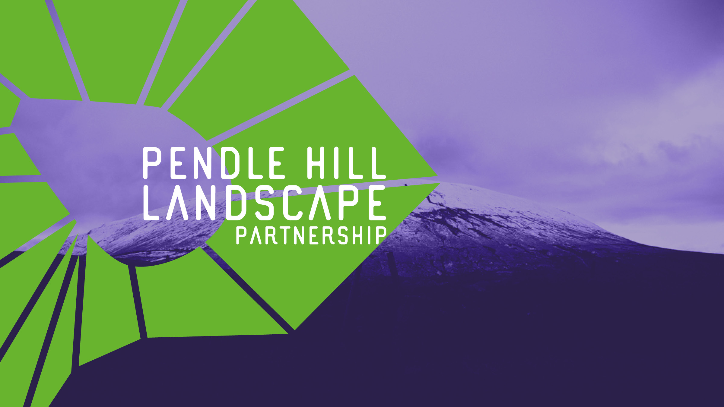
Our solution starts with geography. An abstracted version of the hill at the centre of a network created between the Pendle villages and beyond. This gives us a shape based on community and physical reality, rather than any imagined borders. It is the spaces in-between that are the landscape. The lines between are both connections and broadcast like a beacon from the hill to the surrounding communities, landscape, heritage and beyond.

The resulting shape, the Pendle Jewel, is composed of 15 smaller shapes (including the hill at the centre), one for each of the partnership’s projects, and representing the myriad facets of the landscape, the hill and its people.
![]()
The jewel is paired with a contemporary typeface. This has the feel of a sports or outdoor activity brand. We want to inspire people into the landscape.
The colours speak of grass and heather. They are also the colours of the suffragist movement – a hint of the Pendle radicals that the project seeks to celebrate.
![]()
Usage
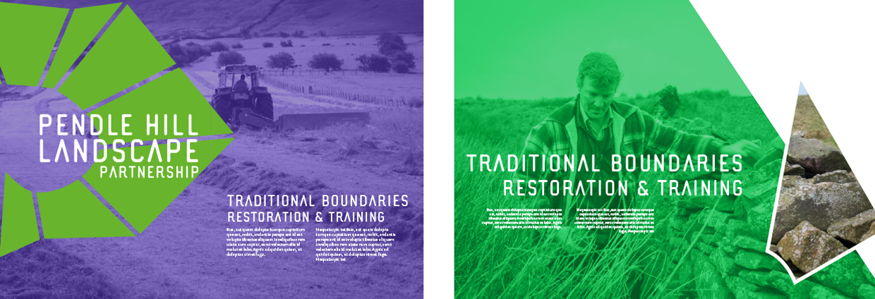
The jewel can be used in many ways. In colour, in mono, outlined, with or without its type. The abstracted shape provides pattern, sometimes soft, sometimes spiky. It can be overlaid on imagery to highlight or contain, or have imagery within it. The interior shapes can be used to illustrate projects or as decorative elements within a design. Like dry stone walling, the non-uniform shapes can come together in many different ways to form something new.
Photography
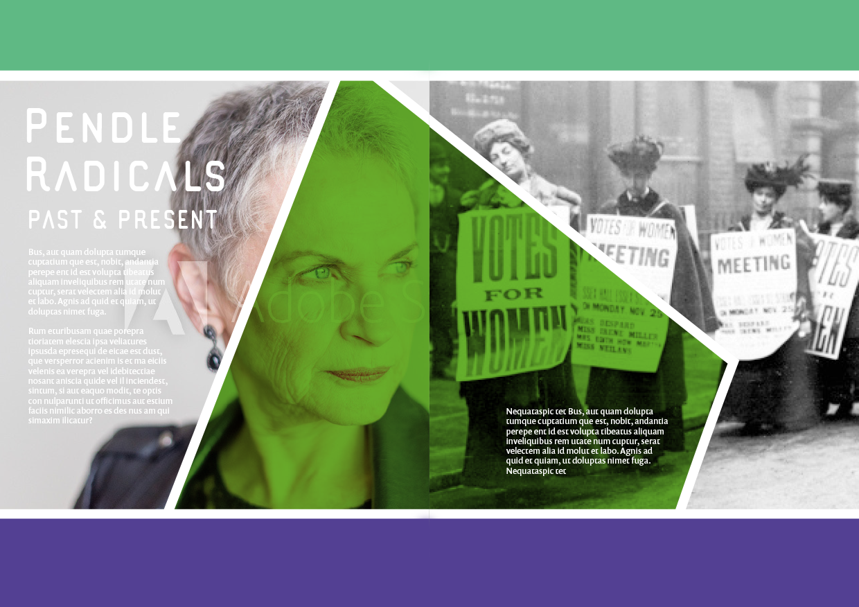
People make the place. Continuing the work done on pendlefolk.com, photography should place people in the landscape. We must show the diverse range of people and activity that make up the Pendle landscape and culture.
High contrast black and white imagery can be used within jewel elements, adopting the green or purple hues. This treatment allows images from the past to sit alongside those of the present. The brand is here to bridge gaps.
Iconography
A set of icons representing the projects, history and landscape will form part of the brand.
![]()
Language
First person narrative, quotes, interviews and Northern flavour. Friendly and approachable with an edge of intrigue, evoking a sense of place.
Your feedback
We’d love your input on this process. Please help us out by answering the following questions.
[contact-form-7 id=”3391″ title=”Untitled”]