Colne
Colne
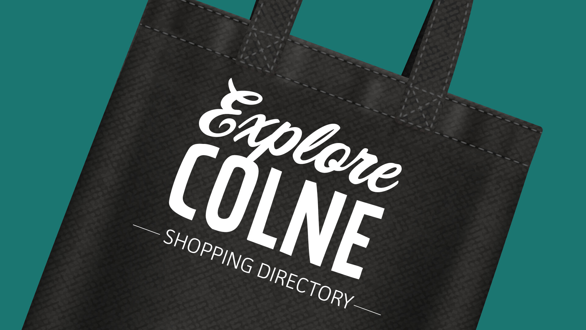
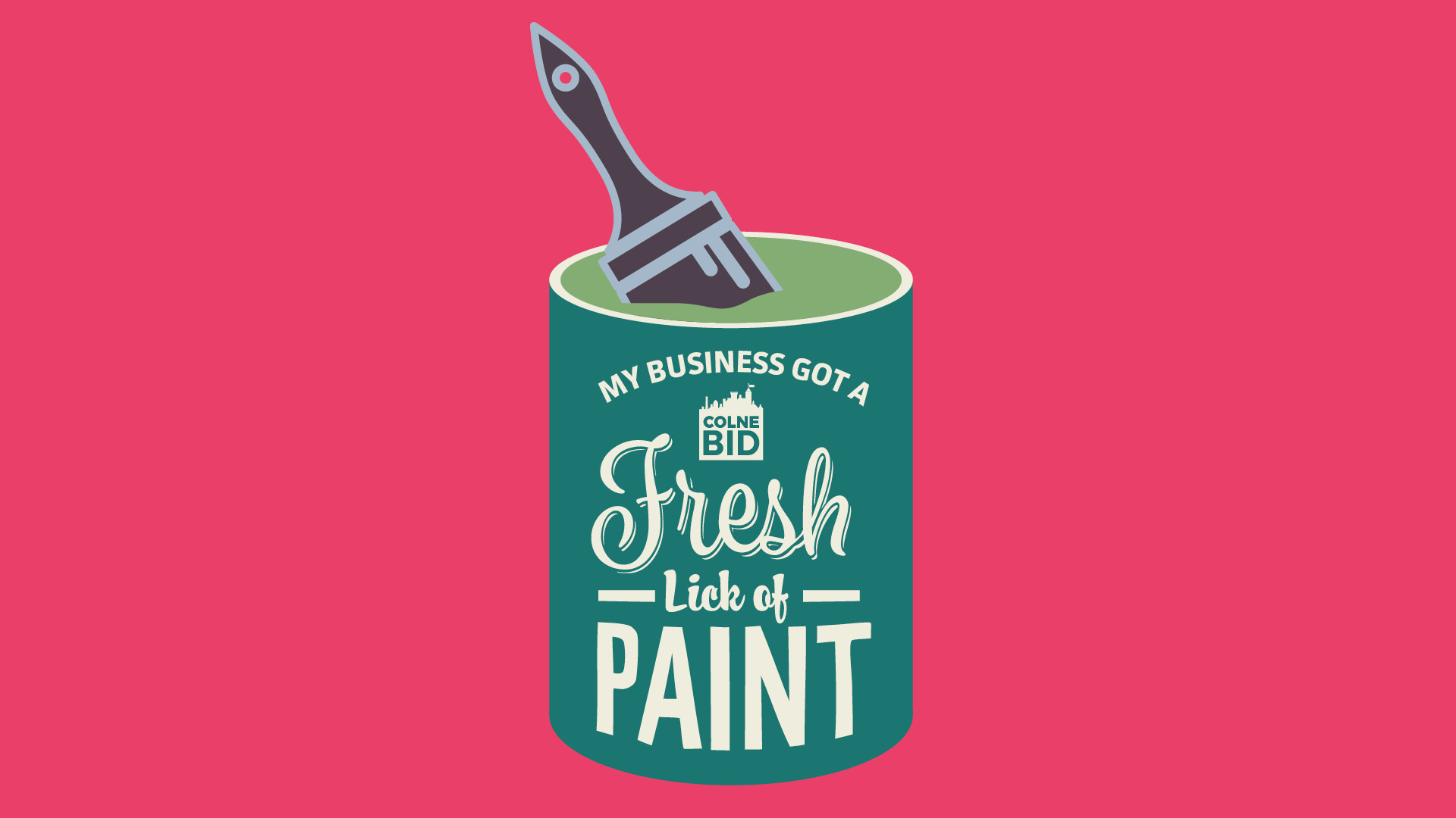
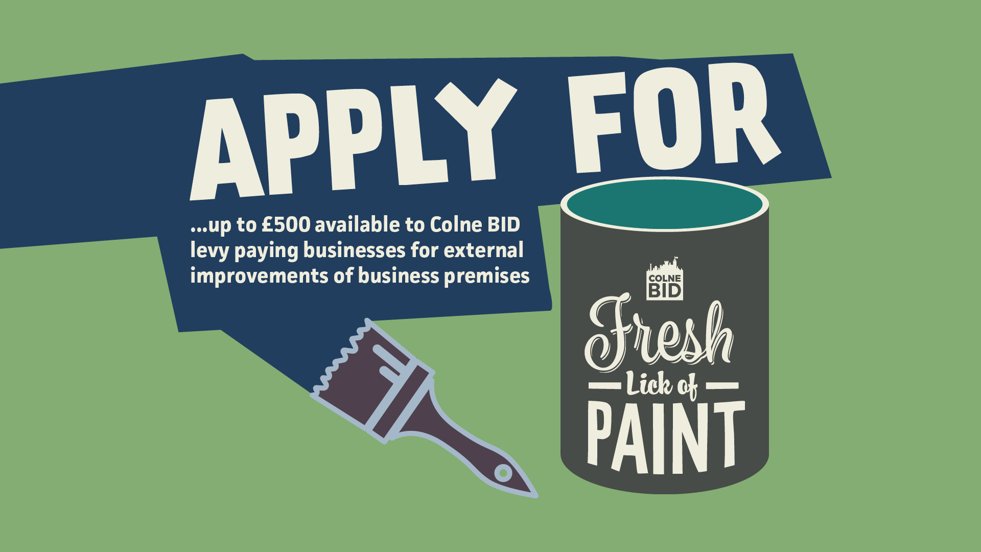
Colne in Lancashire bustles with independent shops and is full of character. Home to award-winning cyclists, four theatres and one of the longest running blues festivals, it has a great deal to offer. What it needed, under the direction of Colne BID, was a fresh lick of paint – a place brand.
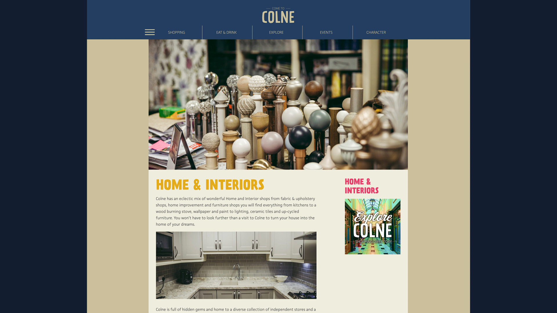
The town has an abundance of interior design shops – it’s a great place to shop when you’re looking for something unique to brighten up your home. Our brand, therefore, had to reflect this, as well as look in-keeping with a multitude of events and other uses.
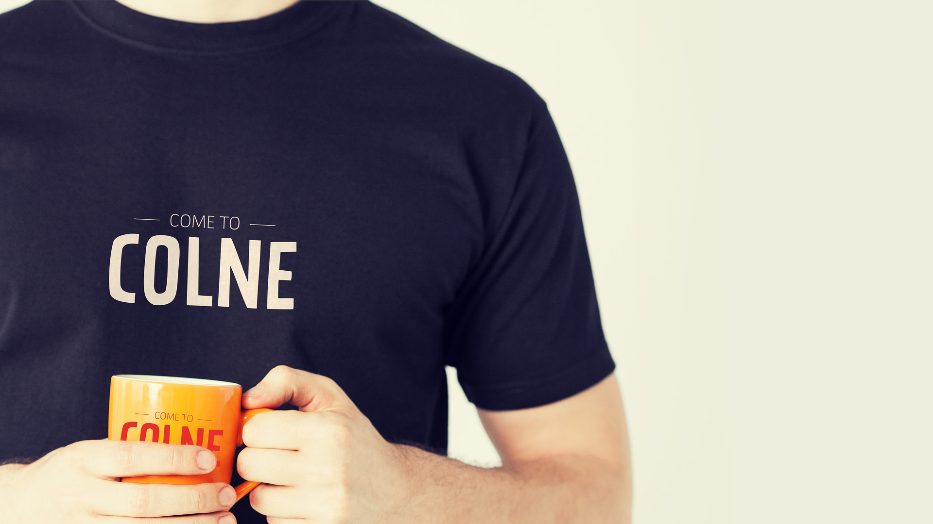
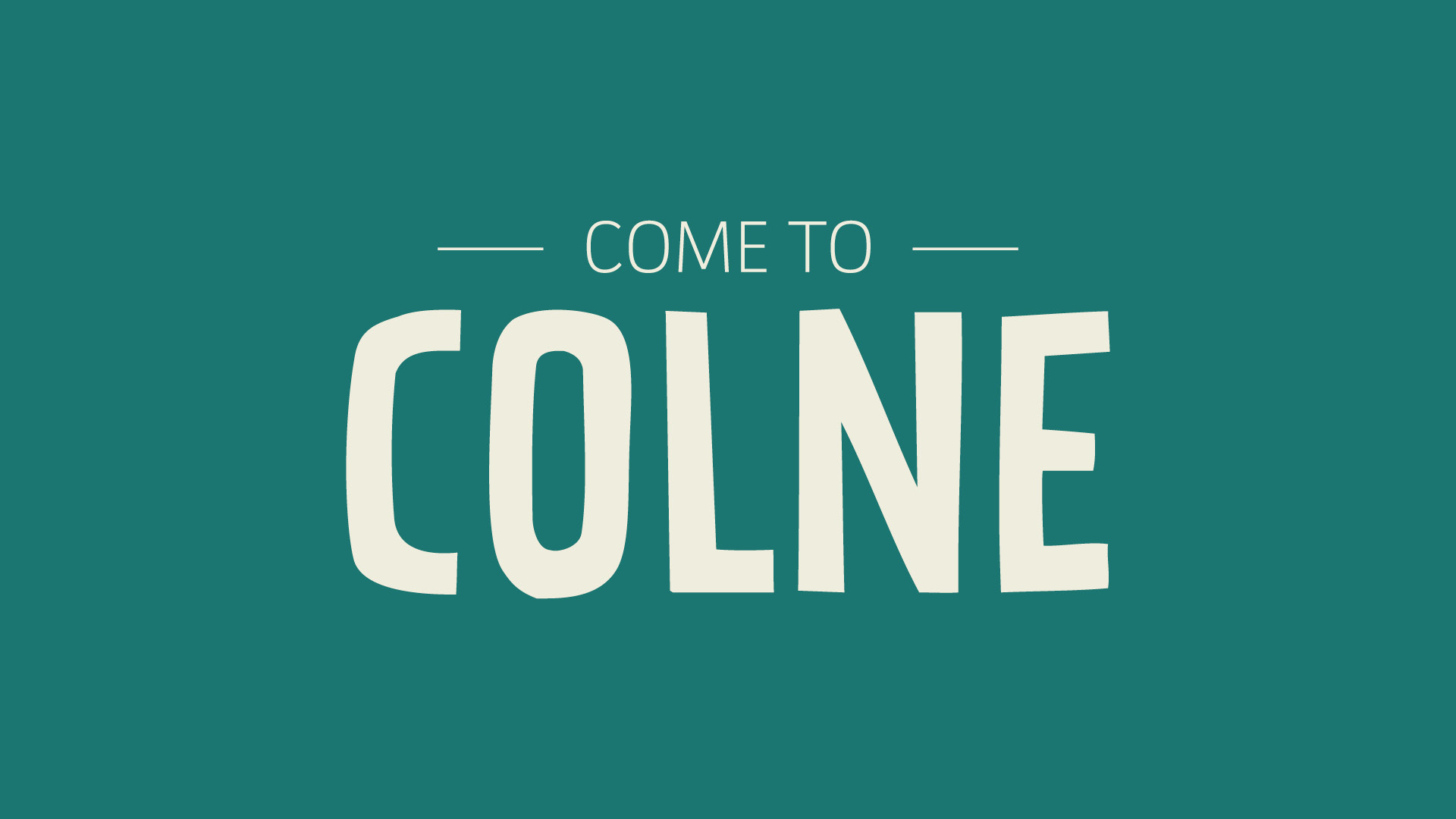
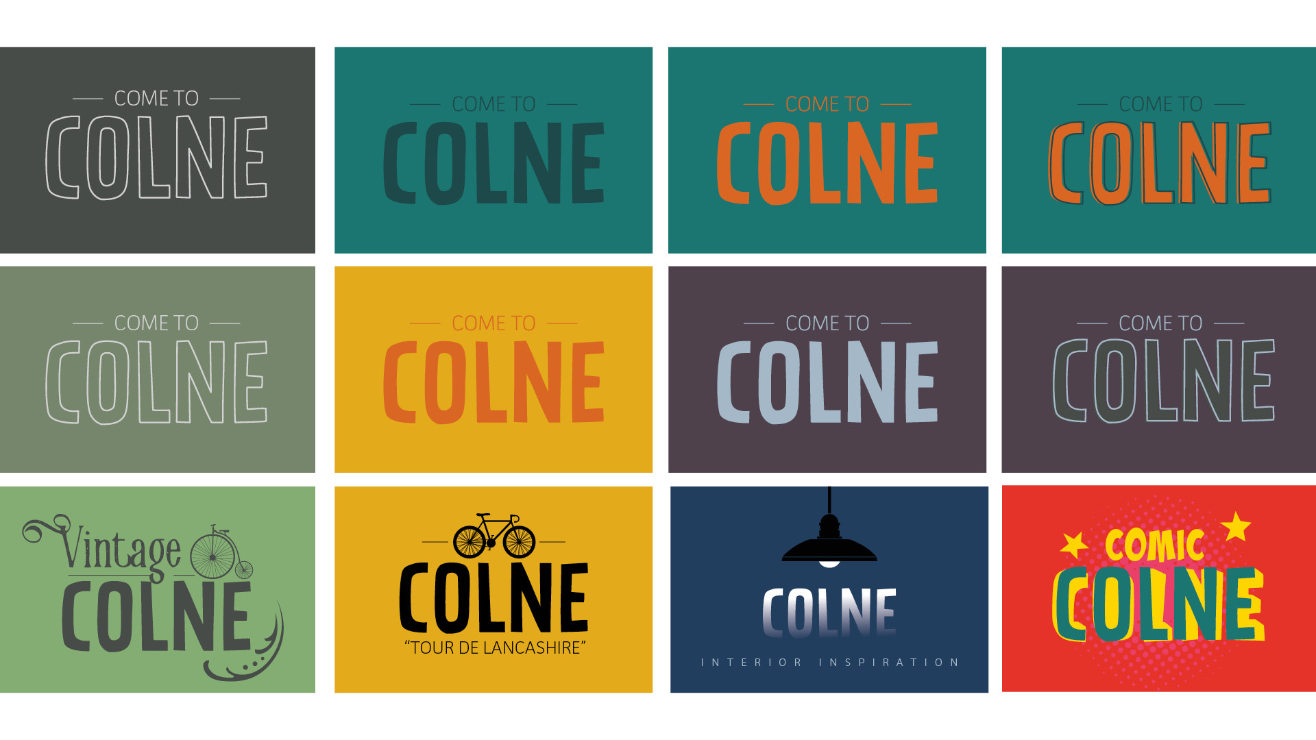
We produced a logo and type style that can refresh with the seasons! A simple system that can work with any colour palette or pattern. Paired with classic, Farrow and Ball-type colours, it looks classy and homely, but when the comic book festival hits town, our logo looks stunning in pink, green and yellow, and thrives against a background of Ben Day dots.
The result can be classic or quirky. The font we have chosen has enough variations that it can flex to the client’s requirements. It was very important to the client that this place brand had longevity, that it would continue to change and grow years after the initial burst of activity.
Find out more at the website we built – cometocolne.com